When you optimize a Call-to-Action (CTA) button, you leverage a remarkable way to increase clicks, email opt-ins, and conversations and sales, to name but a few benefits. But have you checked your CTAs lately? You just might need a tune-up!
These tiny buttons are essential to the success of your marketing campaigns because they move users to take action – and offer them the opportunity to access areas of your website or product page where conversation is the primary motive.
A call-to-action button is so powerful that it has the potential to make or break your business, which is why it’s necessary to have CTAs that are concise.
Why is a Call-to-Action (CTA) important for your business?
A CTA can be found in virtually all businesses – anything that aims to get the user to take certain actions. It’s not just about sales or getting subscribers for your email list, etc. It goes beyond that.
However, in the digital marketing space, a CTA is a lot more important to the success of your digital presence, because the Odds of users clicking on your links, product page, or subscribing to your email list are high. This calls for the need to have an outstanding call-to-action button where appropriate.
And because these little buttons play a crucial role in your marketing campaigns, you have to optimize your call-to-action accordingly to increase clicks and conversions.
These optimization factors include:
- Color
- Message
- Positioning
- … and so on!
CTA Tune-Up: 5 Ways to Optimize a Call-to-Action
Interestingly, there are many ways to optimize a call-to-action. Please ensure you read the entire article to learn the best tips and tricks to optimize your calls-to-action.
Use Color that Grabs Attention
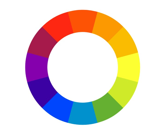
Image Credit: Wikimedia Commons
The first step for me is to identify and use the best color that will grab attention and stand out, but that also blends in with the brand or website.
You can use color combinations, shadows, fonts, borders, etc. The options are endless. The point is for you to choose a color that fits or align with your brand.
Consequently, when choosing your preferred color, ensure you follow these steps:
- The color must grab visitor attention.
- It must stand out from the background.
- The color must not conflict with your brand or website background color.
How can I find a color that grabs attention?
To find a color that grabs your visitors’ attention, simply go to http://buttonoptimizer.com/ and create a variety of buttons and test them out on Facebook by inviting your friends to pick or chose the ideal color that is more noticeable and stands out from the others.
I also suggest using complementary colors. Complementary colors are colors that contrast well enough to stand out, but still work well with another color.
When you choose a complementary color, it becomes the first thing visitors see because it pops out from the other components on your site.
The color wheel above shows 12 shades of colors, but that’s not all there is. There are more colors which you can find at ColorSchemeDesigner.com. Color Scheme Designer shows you color combinations that work well together.
For example, if your website is designed with a dominant purple color, you can see from the color wheel that yellow is the color directly opposite from purple. Hence, yellow is the complementary color to purple.
Make Your Call-to-Action Simple
Inasmuch as you have to incorporate other components to create a phenomenal call-to-action button, work on keeping it simple. Why?
Because simple call-to-action buttons are more effective than the more crazy ones! In fact, testing proves that simple CTAs are the best-performing buttons.
For example, your call-to-action could be something like this: “Click here to get your copy of this book for free.” You may go ahead and add images, annotations like arrows, and so on.
That is not simplicity. But your call-to-action could say instead: “Get Your Free Copy” or “Get Your Free Book.”
Your readers do not need a lengthy, extravagant call-to-action to convince them to buy your products, to opt-in, etc.
Utilize Action Words in Your Call-to-Action Copy
One of the most important components of call-to-action copy is to use verbs. Verbs are words that urge someone to take action.
Some of the most powerful words that move people to take action are:
- Buy
- Try
- Shop
- Get
- Learn
- Visit
Furthermore, research by HubSpot shows that the word “Submit” has a low click-through rate (CTR). So please, do not use it in your call-to-action copy.
The research found that call-to-action buttons with the word “Submit” have a 14% conversion rate versus a 17% conversion rate for CTA buttons without the word “Submit.”
There are other words that generate low CTRs so please, do your research to identify them!
Write Your Call-to-Action Copy in the First Person
In a series of tests performed by Michael Aagard, he saw a dramatic twist in the results he got from the study.
Marketers normally speak in the second person. So in this test, he tested call-to-action copy in the first person, as in “Get My Book,” and in the second person, “Get Your Book.”
The result? The CTA copy that was written in the first person with “My” saw a 90% increase in clicks, while the second-person button with “Your” saw a significant 25% decrease in clicks.
As you can see, the difference in clicks is determined by the person the call-to-action copy is created for.
Positioning and Placement
Where you place your CTA button also plays a crucial role in your marketing success. Ideally, everyone would say the best place to position your CTA button is at the top fold. However, a study shows something remarkably surprising.
In an article published by Kissmetrics, Michael Aagard (mentioned earlier) found that CTA buttons placed far below the bottom fold performed best, with an increase of over 300% lift.
However, results may of course vary in terms of positioning your own CTA buttons.
Pro tips:
- Use multiple CTA buttons to break up pages.
- Place CTA copy buttons directly next to or below where you have informative data.
- Use stories to direct visitors to your CTA buttons.
- Make your CTA stand out with some design tweaks.
A/B test your placement options to figure out the best place to position your CTA buttons. Better still, test not only your CTA placement options, but also A/B test your entire CTA optimization strategy!
Use Proven Strategies to Optimize a Call-to-Action
The CTA is not just about asking – it’s about how you ask! This article demonstrates the importance of call-to-action buttons, and how to best approach and optimize your own CTAs.
Implement proven strategies to increase click-through rates (CTR) and sales. Use these tips discussed above to help generate customer interest – and success in your marketing campaigns. With CTAs, understand that now is usually a good time to schedule that tune-up!
Have you been getting the full benefits of CTA power? Share your thoughts and experiences in the comments!
Moss Clement
Moss Clement is a blogger and freelance writer who delivers high-quality content via writing services such as: blog post writing, article writing, ghost writing, etc.


