Perhaps you’ve heard a bit about landing pages and have implemented one for your product or service, or maybe you’re designing/developing your first landing page. Maybe you’ve even been thinking about improving results through landing page optimization.
Choose the Right Strategies for Landing Page Optimization
Wherever you’re at in the process, as a fellow entrepreneur I know that you want to do things right, and not waste time on things that bring zero results. Research has shown that there are some strategies that definitely work better than others.
7 Tips to Implement and Improve Landing Page Optimization
In this article, I would like to share with you some tips that have proven to produce more effective landing pages.
1. Have many landing pages with different opt-ins.
An opt-in goes together with a call to action (CTA). The user is asked to give some information in exchange for something in return.
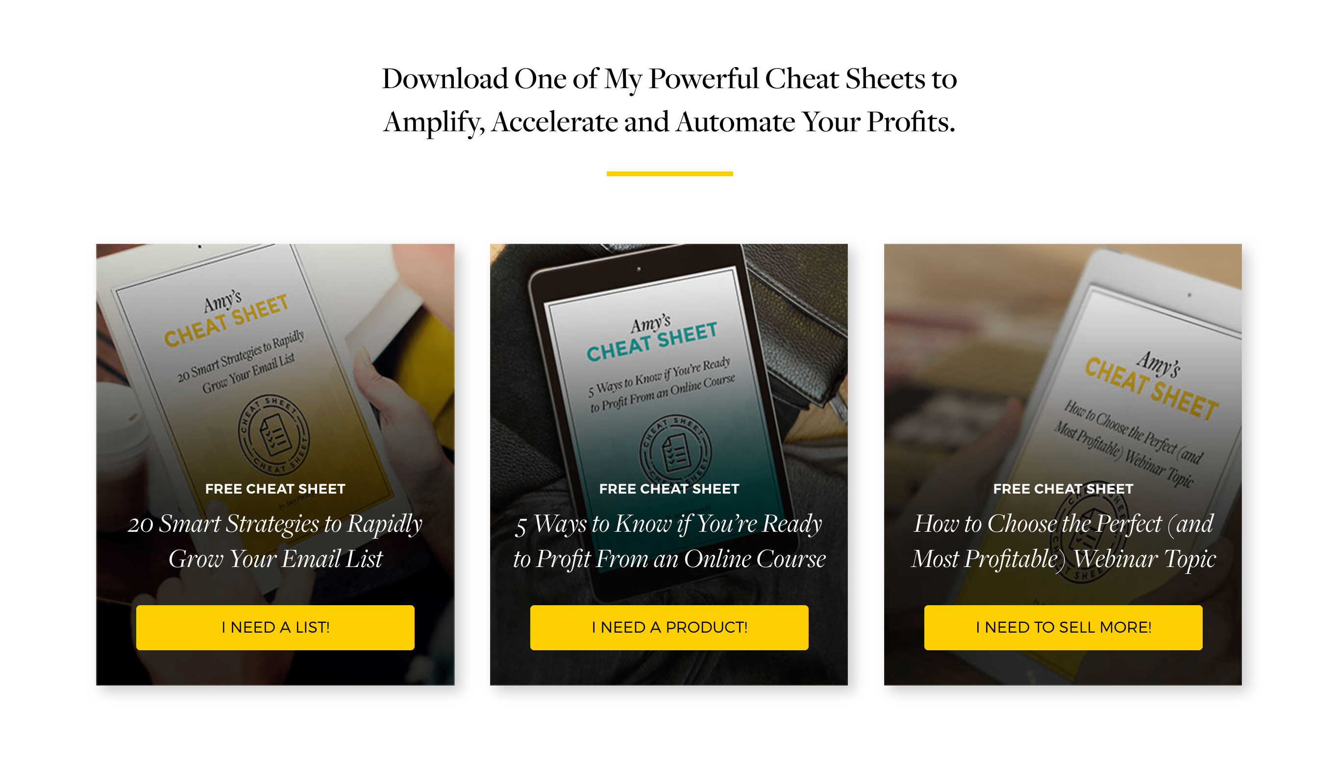
The experts at HubSpot reported that having 10 or more landing pages can result in 10 times more conversions, compared to just using one landing page. If you get creative and begin brainstorming, I’m sure you can come up with all kinds of different “bonuses” that you can offer. Some I’ve seen include eBooks, free trials, access to more content, courses, webinars, discounts, etc.
Take a look at this example by Amy Porterfield. She offers 3 different “cheat sheets” for distinct types of people who land on her page.
Screenshot provided by contributor.
Creating 10 to 15 different landing pages may sound like a burden, but once you design one, others will be easier to produce.
2. Have concrete text on your buttons.
For points 2, 3, and 4 I’d like to give you some advice on how to design the buttons on the landing page. For this point, I’m referring to what’s known as “concreteness.” You want your button to have very clear, specific, concrete instructions for the user. If the text is vague, the user will not clearly understand exactly what they are getting from you.
Let’s take 2 examples of buttons I’ve seen: The first says “Download Now” and the other says “Free unlimited access.” The first one is more concrete and will have a better click-through rate. When I click on the first one, I know exactly what I’m getting and when I am getting it. The second one is appealing, but it still leaves me with doubts about what I am getting.
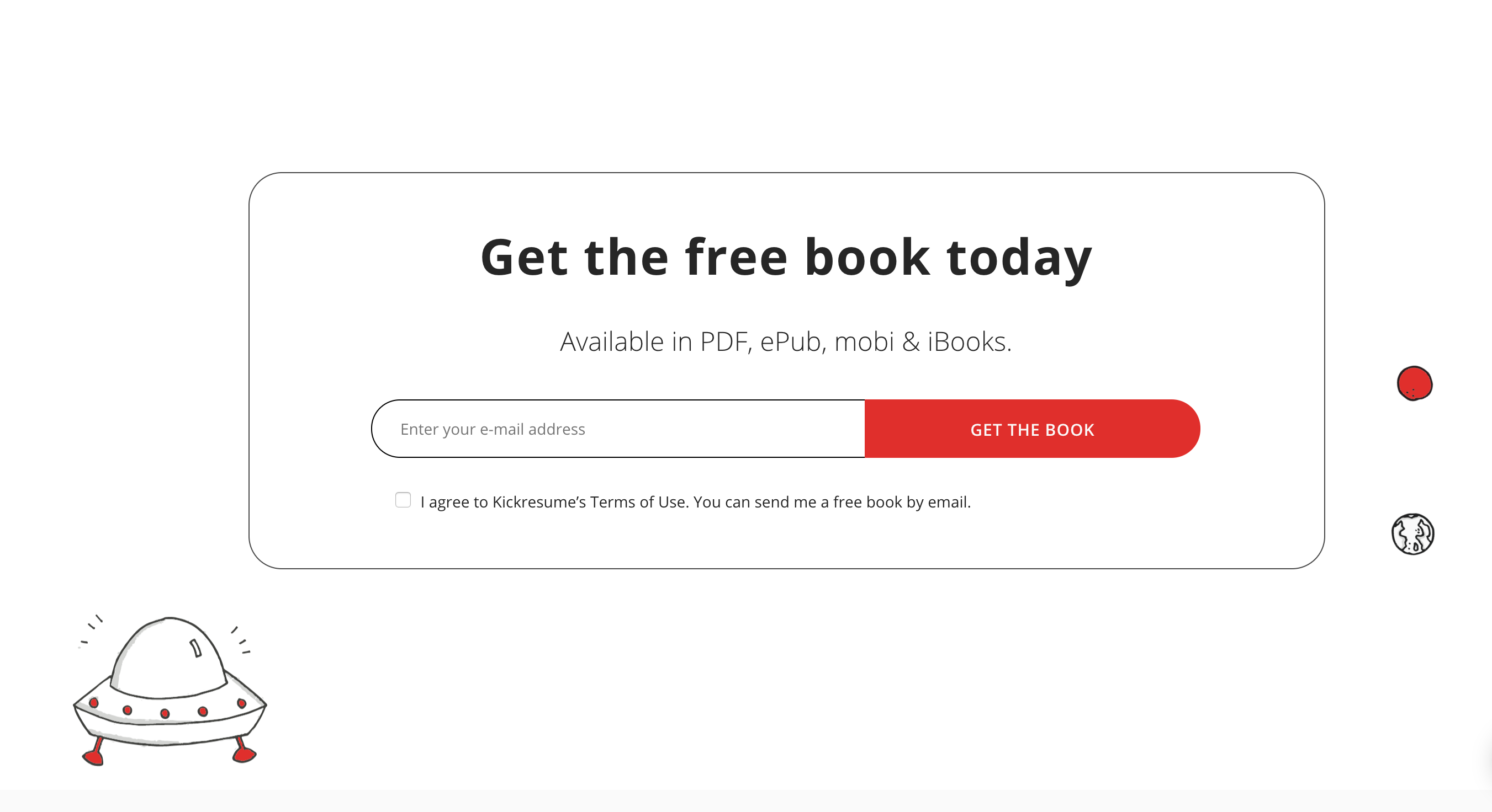
A specific example I can give you for this point is the landing page by Kickresume:
Screenshot provided by contributor.
Here, “Get the book” is as concrete as text can be for the user.
3. Text must be written from the correct perspective.
Others refer to this as having the right point of view (POV). Basically, when you are writing the text, you must keep the user in mind. What are they thinking? What is their thought process? Are there any specific words they are thinking of? Not having the right POV is a mistake I often see from marketers. In their minds, they are focused on selling their product to the user. Text such as “get your free trial” or “see for yourself in our online course” are examples where the POV is not the user, but from the one doing the selling.
Think about when you are considering buying a product. You come across a site that has something you’re interested in, but you’re still not sure. You’d like to be able to interact with the tool before purchasing it. At that moment, the words in your head are not “start your free trial.” No, you are thinking: I want to start my free trial.
If this small change in wording doesn’t seem like a big deal, you’re wrong. Clay Collins, founder of Nomics and Leadpages, compared two buttons with equal text, yet there was one slight change. One had “your” and the other “my.” The “my” option had a 90% better conversion rate! Ninety percent – this is a big deal!
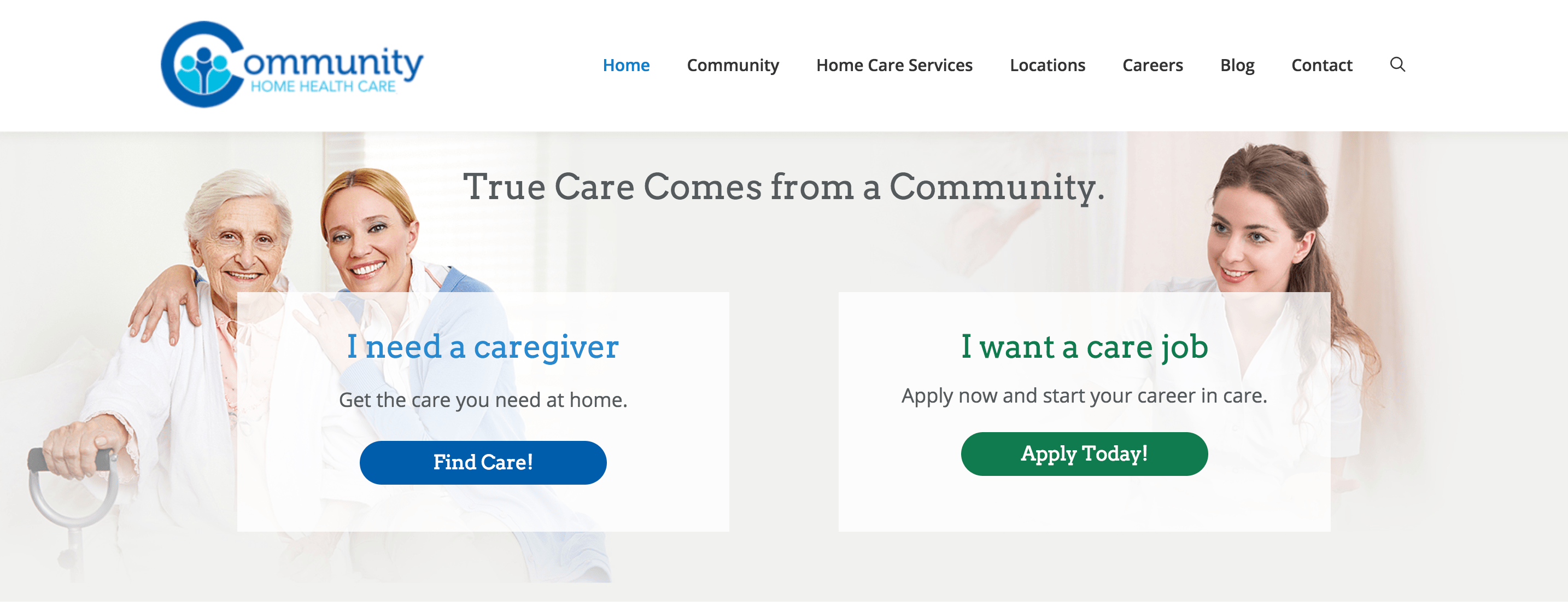
For a real-life example of this, here’s one from a health care company. Notice that the colored, enlarged text is written with the perspective of the user in mind.
Screenshot provided by contributor.
4. Provide an immediate benefit to the user.
This point dealing with buttons has been called “immediacy,” and it goes hand-in-hand with the one on being concrete. Not only does the user expect to understand exactly what they’ll be getting, they also need to be getting it now. In other words, there is an immediate benefit to clicking the button or filling out the form.
In some instances this may be difficult to avoid, especially in the case where you want to tell people about a future website launch. Often I see the famous “Notify me” button on landing pages that seeks to use the news of a new forthcoming website as a means to build contacts. Yet if you think about it, what exactly does the user get from Notify me? Some of the leads created here will obviously be waiting eagerly for the report that the new site is finally up and running. However, over time many will forget about your service, and in this time frame may even decide to buy a competitor’s service.
What you need to do with the text is make the user feel as if they are getting something valuable at that moment. No waiting around needed.
For example, when we start with our business, a button with “Tell me more” improves our conversion rate by 38.3% over “Notify me.” By clicking “Tell me more” the user knows exactly what they will get after clicking the button. They will have additional information in their hands immediately.
Below you can see an example of a landing page with no immediacy. By providing my email, I am not given anything in exchange at that moment in time.
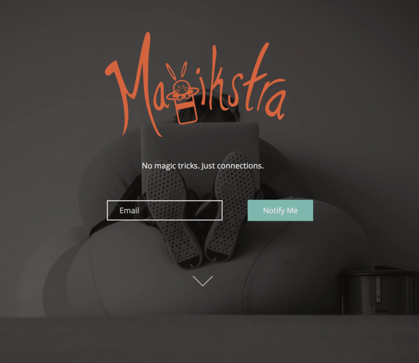
Screenshot provided by contributor.
5. Force people to make a decision.
Usually, when we force someone to do something there is a negative result. However, with landing pages, forcing a decision can work to your advantage.
One method for forcing a decision from the user is a pop-up box, often called a “lead box.” The box can either pop up automatically, or after the user clicks somewhere on the page. Then the user must decide to either accept the opt-in or decline it. They must decide either YES or NO. No other options are available.
Here is what a real one looks like; this one is from Wishpond. Notice that the user only has two options once this box appears: (1) Get Started or (2) Not today.
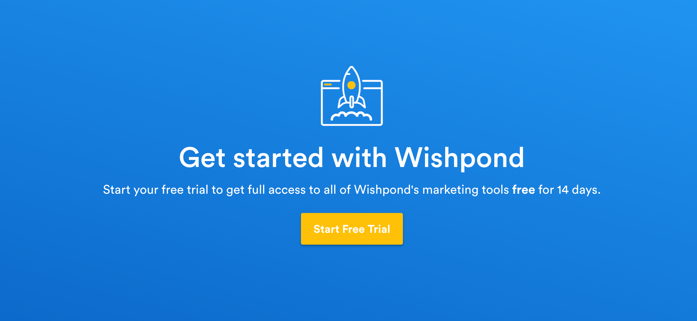
Screenshot provided by contributor.
The reason this tactic is beneficial is sheer numbers. If you have 1,000,000 visitors to your site, yet none of them made a decision on your product, then you will have made exactly zero conversions from those 1,000,000 visits.
Now let’s say you have only 10,000 visitors, but each visitor is forced to make a decision. Even if only 1% of them decide positively, you have made 100 conversions. So running the numbers shows that it is better for people to make a decision, than to make no decision at all.
6. Use testimonials directly on the landing page.
Testimonials are a powerful way to gain the trust of potential clients. They have shown to be very effective on websites in general. This is true for landing pages as well.
For testimonials you could include a list of your clients, some specific quotes, case studies, twitter cards, and more.
I would like to share one example here, this one by collect.chat:
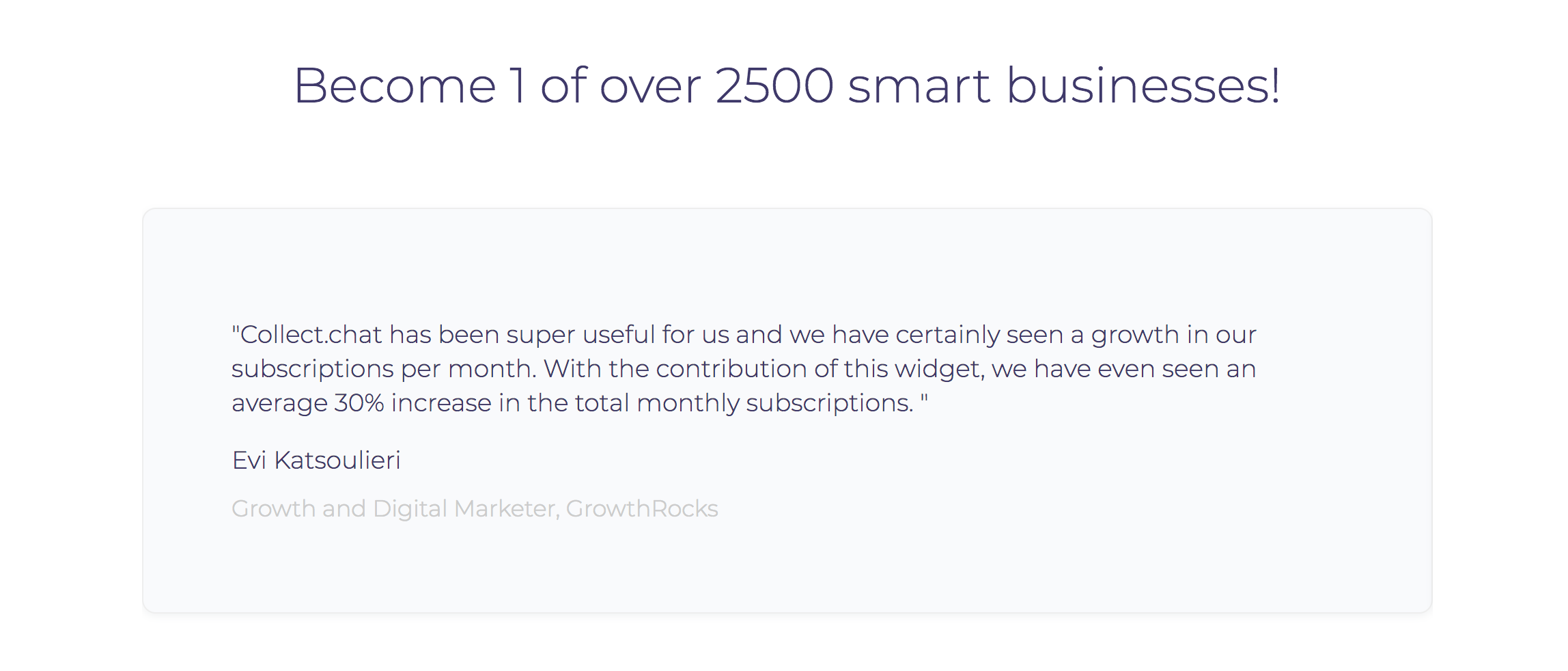
Screenshot provided by contributor.
7. Include an opt-in opportunity on your blog posts.
Many businesses have implemented a blog as a way to market their company. A blog can help boost your website’s SEO rankings and can establish your brand as a reference in the sector in which you’re working. If you do not have a blog, I encourage you to start one. If you do, please take this piece of advice: for every post, include an opt-in opportunity.
It takes time and effort to write articles for a blog. Why not get the most out of your efforts? Be sure to include somewhere on your post pages where the user is provided with a call to action.
Take a look at this specific blog post by Dustin Mathews:
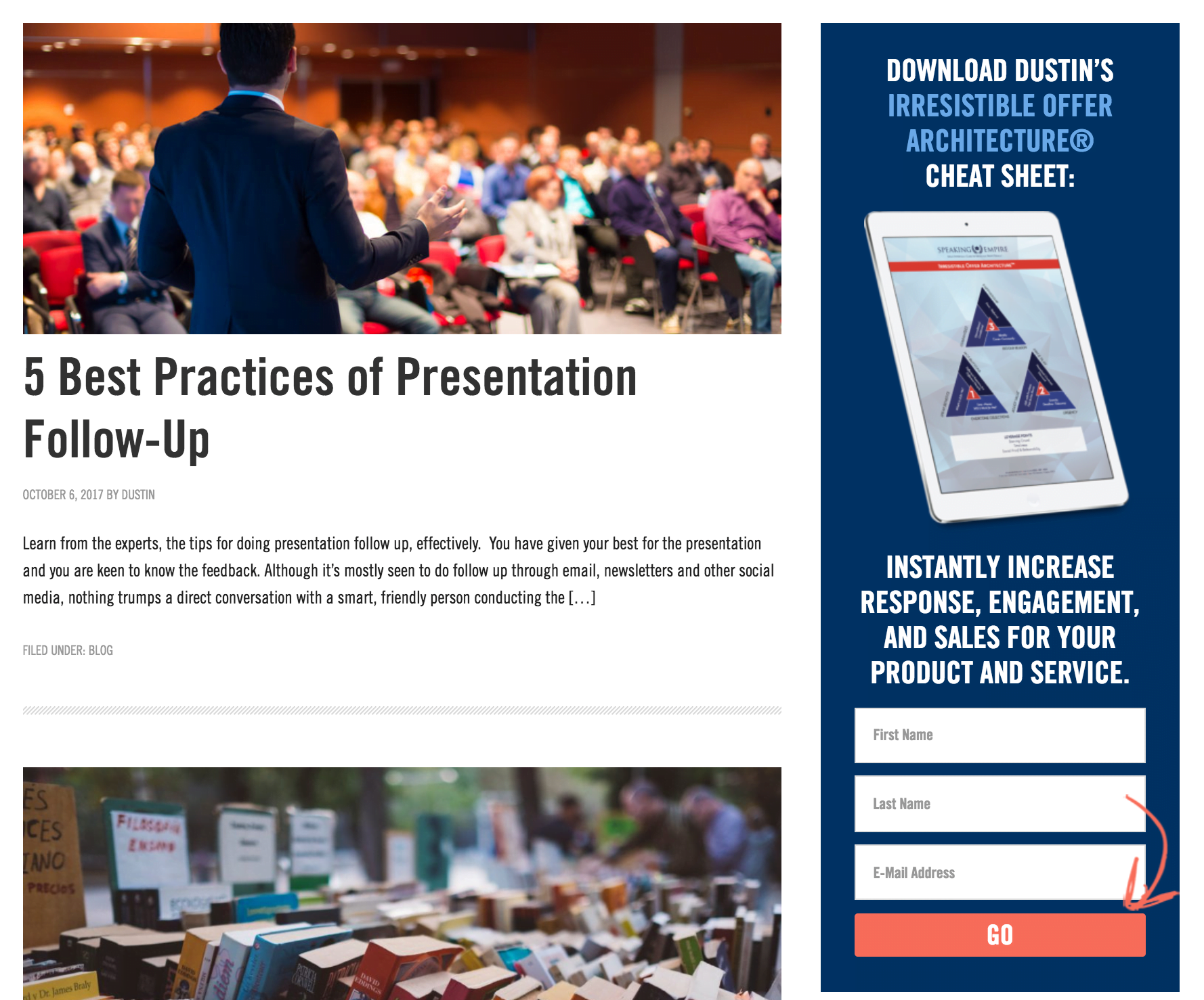
Screenshot provided by contributor.
Besides the content of the article, the reader can easily see that they may receive additional content by providing information.
Put Landing Page Optimization in Your Deal-Closing Toolbox
According to an online dictionary, landing pages are also known as “where the deal is closed,” as it is landing page actions that determine an advertiser’s conversion rate success.
As a fellow entrepreneur, I know how concerned you are about sales, conversion rates, and success. Remember to drop these tips and strategies into your deal-closing toolbox – and use them – so that you may get the most out of your landing pages.
Does landing page optimization have a place in your toolbox yet? Which of these 7 tips will you employ first? Share your thoughts and experiences in the comments!
Cristian Rennella
Cristian Rennella, Chief Marketing Officer of EMT, which help users in México, Brazil and Argentina to compare services online.


